Alert: Canvas Outage Update
Canvas access has been restored for our users, but the service reliability remains uncertain. Due to recent events, Canvas has had intermittent outages which are at the discretion of the vendor and may occur during a final exam. Faculty and staff may continue to use Canvas, but we strongly advise faculty and students to prepare a contingency plan for turning in assignments and final exams in the event Canvas access becomes unavailable again.
Instructure, the company that owns Canvas, has provided an FAQ about the incident, which may not answer all your questions. We will share more information if it becomes available.
Instructure, the company that owns Canvas, has provided an FAQ about the incident, which may not answer all your questions. We will share more information if it becomes available.
Learn More
BRAND STANDARDS
Logos & Marks
Updated Fall 2025: To strengthen CU Anschutz’s identity as a leader in transformative education, science, medicine and healthcare, we are retiring all individual school, department and unit logos. Moving forward, only the official, updated campus logo and updated school lock ups may be used, with limited exceptions approved by the Office of Communications. This unified approach will enhance name recognition locally and nationally, reinforce our collaborative mission, and support the life-changing discoveries of tomorrow. This will be a phased change, and you will be notified by campus leadership when your school/department is expected to implement. We have updated our guidelines with new resources to show you how to effectively market and identify your school/unit without needing a logo. Find out more about the brand alignment initiative here. |
As the primary visual identifier for CU Anschutz, the campus logo must be used on all forms of communication, whenever and wherever the university is being represented. Every communication we create is an opportunity to tell our internal and external audiences who we are, both as part of the larger CU System and as a university with a unique and vital mission.
Thoughtful and consistent application of the campus logo strengthens recognition for CU Anschutz, helps build a more unified brand and connects us to the University of Colorado system.
The development or use of custom-designed logos, school or department logos, or graphic symbols for identification are expressly prohibited for all CU academic, administrative, research and clinical units and groups. More information can be found in CU System Administrative Policy Statement 2025.
Logo Anatomy

The campus logo unites two elements in an intentional and fixed arrangement:
- The CU icon is comprised of the gold, stylized letters “C” and “U” over a field of black. This graphic is shared across the entire University of Colorado system and used by all CU campuses.
- The wordmark is a custom letterform used in conjunction with the CU icon. Together, these elements appear as a single graphic element and may not be altered, replaced or retyped in any way.

Configurations

The primary logo should be used in almost all communication and marketing applications.
The full logo should be reserved for formal uses where spelling out the full university name would be useful. Examples include legal documents, website headers and other official documents. The full logo should not be used on flyers, swag, social media or print advertising. Please contact [email protected] if unsure which logo to use.
Color Options
The full-color campus logo is the preferred format and should be used whenever possible. In cases where a full-color logo may not be applicable – for example, black-and-white collateral, single-color embroidery, etc. – a single-color (white or black) version may be used. Recoloring or altering the colors of our logos in any way is prohibited. Color combinations other than those listed below are unacceptable and not permitted for use.


Minimum Size
In order to ensure legibility, the campus signature must not appear smaller than the sizes below:
- 0.5" tall for print or physical media
- 40 pixels tall for online or digital media

Clear Space Guidelines
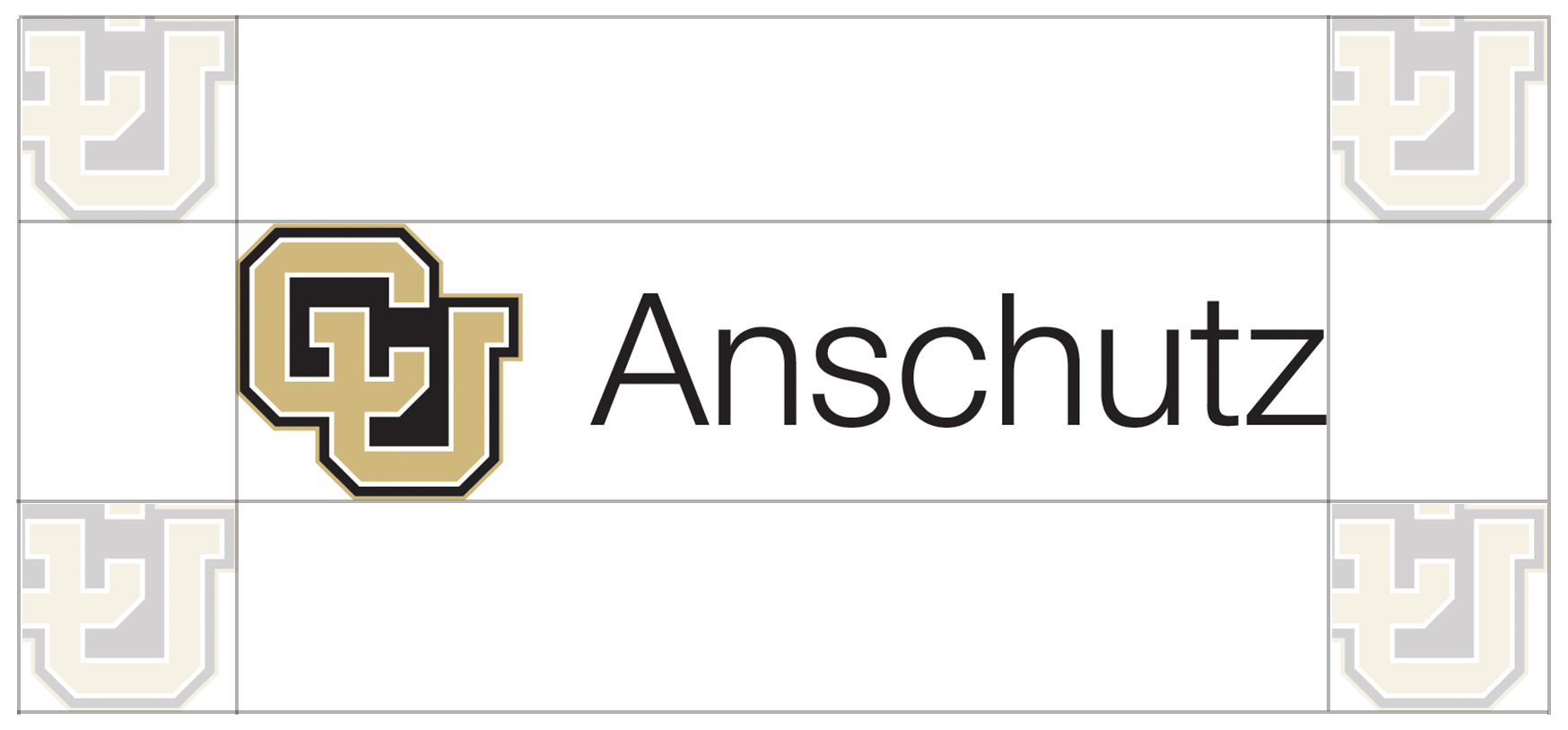
Clear space must always surround the campus logo, to improve visual impact and ensure legibility.
The minimum acceptable clear space is equal to the height of the "U" in the interlocking CU icon as it appears in the campus logo.

Logo Variations
The brand equity for units, schools and colleges rests with their affiliation with the University of Colorado and its campuses. Subidentities (including logos, wordmarks, typefaces and alternate design elements other than those officially approved) detract from the university’s ability to project a consistent, coordinated identity.Therefore, the development or use of independent logos, graphics or word marks by CU Anschutz entities that deviate from the guidelines detailed in these standards is not consistent with university brand policy and is strictly prohibited without written approval from the University Brand Identity Standards Board, campus chancellor and CU president.
More information can be found in the CU System University Brand Identity and Trademarks Policy.
Additional Guidance
Common Misuses
The campus logo is a registered trademark and cannot be altered. Always use official artwork and observe standards for color, clear space and minimum size.
- DO NOT Create your own logo for your departments. As of fall 2025, there are no unit and department logos allowed below the school and official center and institute level
- DO NOT stretch, condense or distort
- DO NOT recolor or redesign
- DO NOT add text or graphics to official CU Anschutz logos
- DO NOT place multiple CU logos in the same design area
- DO NOT use any retired logos like the campus logo with "medical campus" or previous school, unit or department logos

.tmb-image350.jpg?Culture=en&sfvrsn=5479d4b4_1)


