BRAND STANDARDS
Colors & Fonts
Color
Aside from our logo, our brand colors are the most identifiable element of our university's visual identity. Used accurately and consistently, they connect and strengthen the impact of our visual communications.
As part of the web brand identity standards we have outlined a suite of approved web colors that can be found below.
Official CU Colors
Our colors are black and gold. They are a required element in all visual communications and should feature more prominently than any other colors.
Always reproduce our brand colors faithfully and accurately, using the values below.
CU Black
HEX #000000
RGB 0 / 0 / 0
CMYK 0 / 0 / 0 / 100
CMYK 40 / 40 / 40 / 100 (Rich Black)
PMS Black
CU Gold
HEX #CFB87C
RGB 207 / 184 / 124
CMYK 0 / 10 / 48 / 22
PMS 4525
Thread color: Madeira 1305, Polyneon 1939 or Vegas Gold
CU White
HEX #ffffff
RGB 255 / 255 / 255
CMYK 0 / 0 / 0 / 0
CU Light Gray
HEX #bcbcbc
RGB 188 / 188 / 188
CMYK 0 / 0 / 0 / 26
CU Dark Gray
HEX #434343
RGB 67 / 67 / 67
CMYK 0 / 0 / 0 / 74
Accent Colors
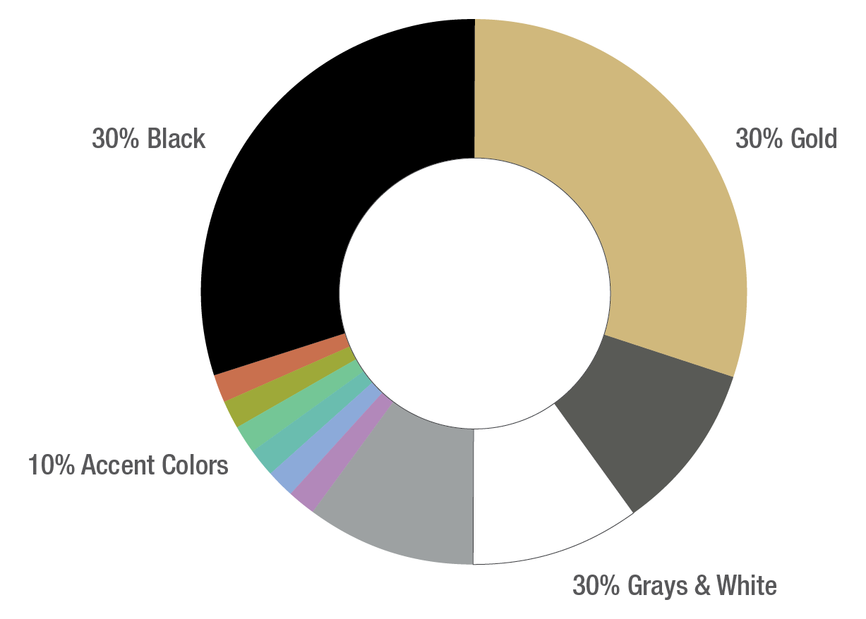
Color is an important part of our visual system. To maintain consistency in our visual identity system, it is essential to reproduce our colors accurately and consistently in all our communication. This scale is an example of how much each color should appear in proportion to other colors; primarily black and gold, with dark and light grays secondary. Tertiary colors may be used in moderation, but never as a replacement for, or an equal to, the primary or secondary colors. CU Gold may in some cases be used at various levels of opacity over white. Always follow the Pantone, CMYK, RGB, or web/hex values shown on this page.

Action Colors
In select cases, colors beyond our accent colors may be used to indicate important information and/or recommended user action. Action color use is rare and limited to the following shades and/or circumstances:
- Red = warning, danger, no, not permitted
- Green = safety, approval, go, yes
- Orange = caution, construction
Color Considerations for Accessibility
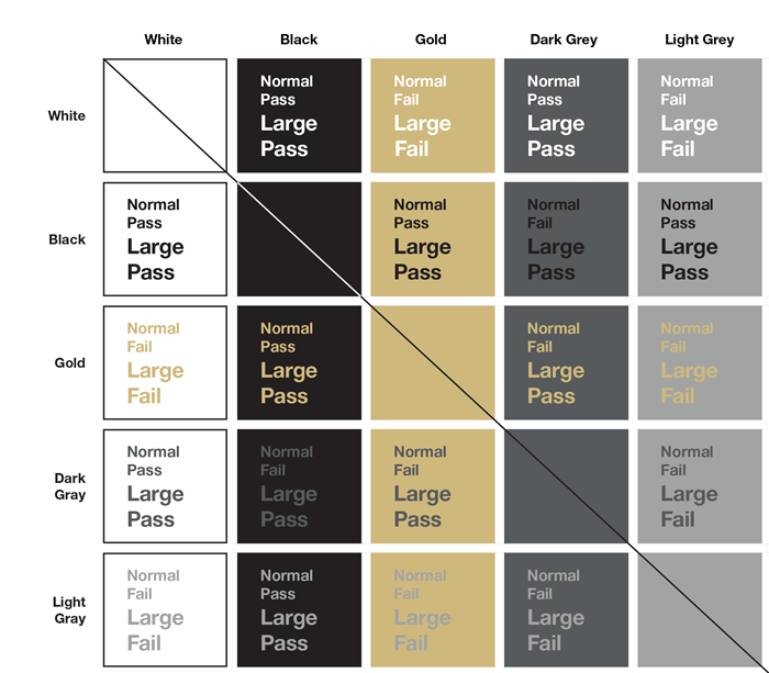
In order to make content as readable and accessible as possible, use the chart below as a guide when creating branded designs. For example, white text in normal or large font size over a gold background is not readable, therefore failing for accessibility.

Looking for branded design templates?


Typography
Typography plays an important role in establishing and reinforcing our brand. When used thoughtfully and consistently, typography becomes an effective tool for adding visual meaning to our communications.
CU Anschutz's official typeface is Neue Helvetica. It is a highly legible, classic typeface that is suitable for all size placements. It is used equally for headlines and body content and is featured in our logo wordmarks.
In cases where Neue Helvetica is unavailable, Arial may be used as a substitute for print applications.
For web and digital applications, CU Anschutz's alternative typeface options are Roboto and Source Sans Pro. They are both clean, sans-serif typeface options that closely approximates Neue Helvetica in web and digital environments.
Typeface Licensing
Units and individual users may purchase Neue Helvetica for their own use from fonts.com.
Source Sans is available for use, free of charge, from Google Fonts.
Primary Typeface

Alternative Typefaces (Web & Digital)

