WE ARE
CU Anschutz
Unified. Recognized. Ready for What's Next.
CU Anschutz is a place of breakthrough science, exceptional care and transformative education. We are powered by a community of innovators, caregivers and learners who are shaping the future of health.
Thanks to your work, we have reached new levels of distinction in Colorado. Now, it’s time to elevate our visibility and reputation nationally. That starts with our brand.
In today’s competitive market, we need a brand that reflects our shared purpose and unifies our community under one bold, unmistakable identity ‒ a brand that’s simple, memorable and easy to connect with. One that represents what we are rather than simply where we are.
Why Brand Alignment Matters
Our brand is more than a logo. It’s how we show up in the world. It’s the clarity we bring to every message, every story and every interaction that makes us familiar and meaningful.
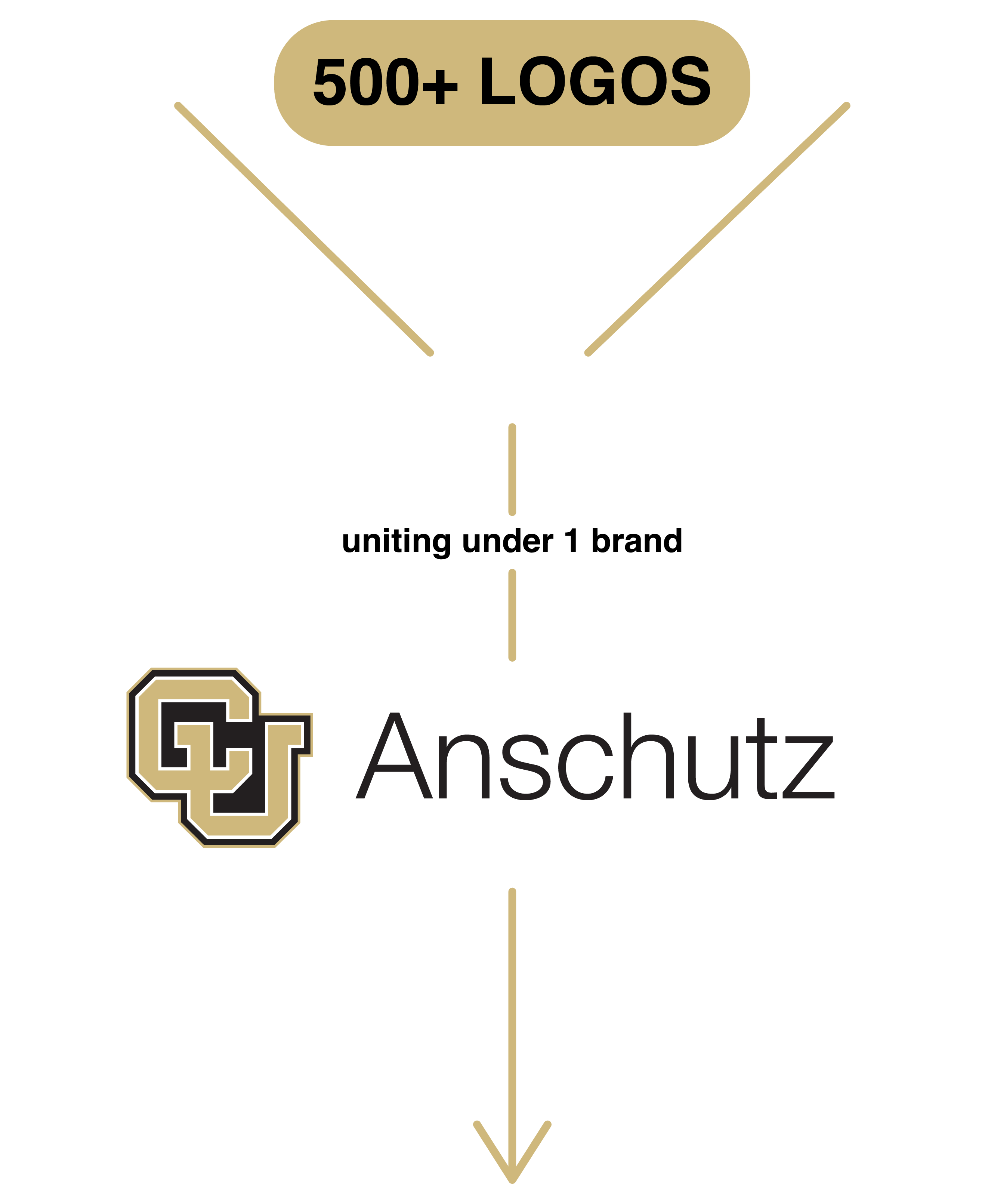
With over 500 logos and naming conventions currently in use across campus, our identity has become fragmented. This lack of consistency creates confusion and dilutes our impact.
To be seen, understood and remembered, we must speak with one voice.
Resulting in:
National Recognition
Helps position us as a leading academic medical campus, ensuring our voice carries influence broadly.
Recruitment
Attracts top faculty, researchers, staff and students who want to be part of a recognized leader.
Funding and Grants
Builds credibility with granting agencies and partners, signaling we are a strong and reliable investment.
Philanthropy
Inspires confidence in donors who want their contributions to fuel meaningful, high-impact work.
Partnerships
Encourages collaboration with industry, government and other institutions who see us as a trusted, innovative partner.
Community & Alumni Engagement
Strengthens pride and loyalty among alumni, local communities and stakeholders who amplify our story.

Our Anchor Brand: CU Anschutz
Leading institutions like ours create strong, recognizable brands by establishing a clear anchor brand, from which all else builds. This isn't about replacing the unique identities of our schools and programs. It's about reinforcing them through a unified anchor brand - CU Anschutz - that elevates every part of our campus.DEPARTMENT, PROGRAM, ADMINISTRATIVE UNITS WILL NO LONGER HAVE INDIVIDUAL LOGOS
What’s Changing and What’s Not
What’s changing: We’re aligning under a unified CU Anschutz brand identity ‒ bringing consistency to our naming, logos and messaging across campus. As part of this effort:
- Our full campus logo will be updated, and we will remove the “medical campus” descriptor to better reflect our full scope and align with the CU System.
d811057d-3922-4526-808b-ce9d00d344c8.png?sfvrsn=4a81ebb4_1)
- Logos for our schools and college will be refreshed to highlight the CU Anschutz brand more prominently, followed by the school name. Please note: the Colorado School of Public Health has its own set of tri-institutional brand guidelines and will not be changing at this time.
Schools and college approved branded logos:
- School of Medicine
- School of Dental Medicine
- Graduate School
- Skaggs School of Pharmacy and Pharmaceutical Sciences
- College of Nursing
If your unit is not on this list, you do not get a logo.
.png?sfvrsn=8580ebb4_1)
- This updated structure strengthens our collective identity, making it easier for external audiences to recognize and trust the excellence associated with CU Anschutz.
- By leading with a unified brand, schools, departments and programs gain greater visibility, credibility and connection to the broader impact of our campus.
- Individual department, unit and program-level logos will be retired, in order to reduce fragmentation and strengthen our collective presence. There will be no new department or unit logos created and units may not create their own new logos.
.png?sfvrsn=7780ebb4_1)
![]()
.png?sfvrsn=b06f4b4_1)
.png?sfvrsn=9518f4b4_1)
- Editorial guidelines and naming conventions will be updated to reflect our unified brand, ensuring our shared identity comes through not only in our visuals but also in our written and spoken communications. References to schools, departments, units, centers, institutes, and programs will now lead with CU Anschutz (e.g., “CU Anschutz School of Medicine”), reinforcing consistency and strengthening recognition of the campus as a whole.
What’s not changing: Our mission ‒ and the work you do every day to carry it forward ‒ remain at the heart of CU Anschutz. This initiative is designed to support and elevate everything you do – making it easier for the world to recognize the excellence you deliver every day.
One Brand. One Voice. One CU Anschutz.

This is a collective effort and a shared opportunity. By aligning our brand, we strengthen our reputation and elevate our visibility among the leading academic medical centers in the country.
Thank you for taking part in this journey. Together, we’ll tell the CU Anschutz story with clarity, unity and pride.
FAQs
A Phased Approach
.png?sfvrsn=8ad0ebb4_0 "timeline-graphic (2)")
We are taking a phased approach to implementation, beginning with our academic programs. We will start with the School of Medicine this fall, working in close partnership with the dean and leadership team. With their engagement and support, we will set a strong foundation for the campuswide rollout to follow.
While one-on-one support will be provided according to the timeline below, all units are encouraged to begin using the new brand guidelines now. This website offers tools, templates and guidance to get your team started at any time.