

Text accessibility means formatting text in a way that makes it easy for everyone to read and understand the meaning. Headings and link text are related to text accessibility.
To create accessible text, it is necessary to pay attention to font choice, size, spacing, visual style, and proper use of lists and tables.
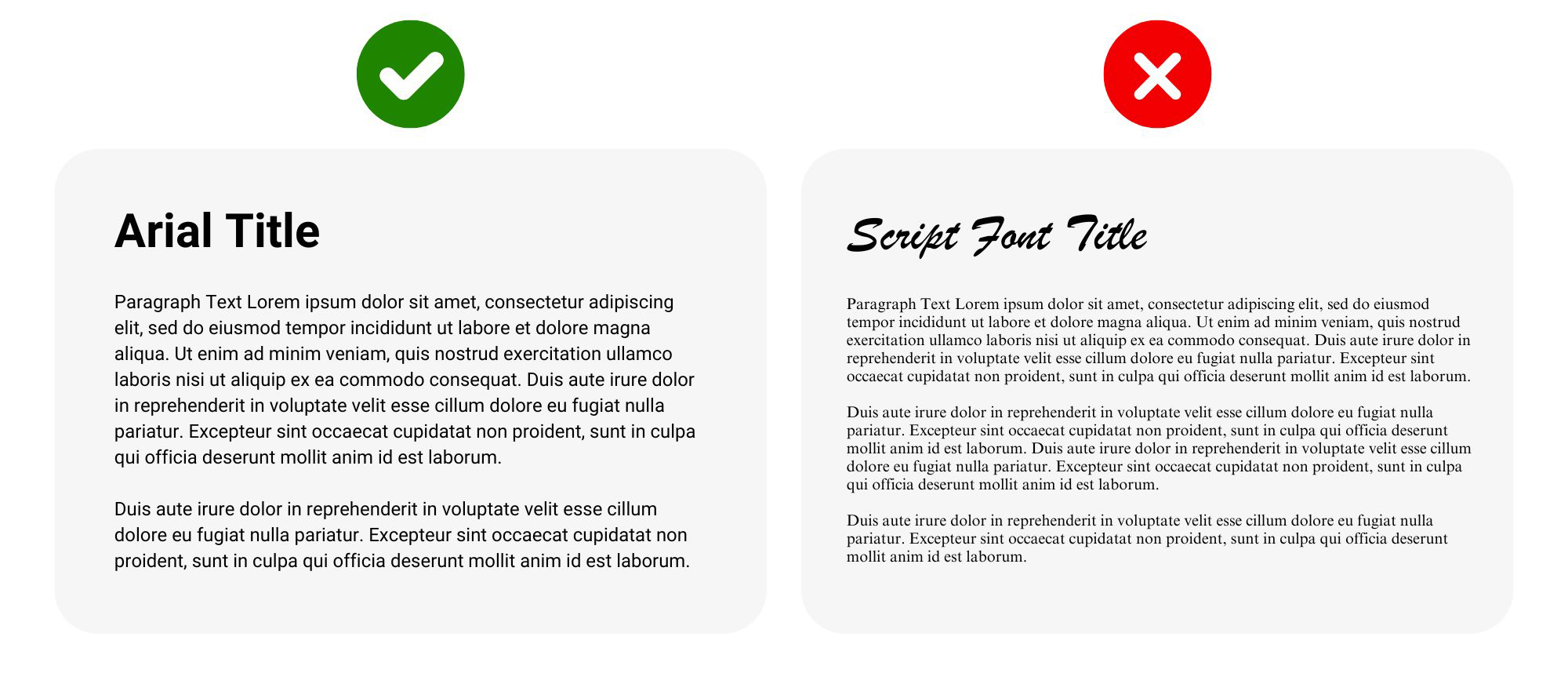
Use clear, legible fonts with a minimum size of 14pt and recommended line spacing of 1.5 for readability. Remember to follow CU Anschutz Brand Standards for font selection.
The following are CU Anschutz standards for minimum font sizes based on content type:
| Content Type | Minimum Font Size |
| Documents, eComms, PDFs, Print | 14pt |
| University Websites (Sitefinity) | 16px |
| Presentations (e.g., PowerPoint) | 18pt body text, 24pt title text |
| Regular Emails | 11-12pt |
Visual style includes italics, bolding, and underlines. Using visual style can enhance readability for sighted people but never rely on visual style alone to convey meaning.
Lists group related items and are either ordered (numbered or lettered; the order matters) or unordered (bulleted; the order does not matter).
To be accessible, lists must be properly formatted using the list feature in your content editing tool (e.g. Canvas, Microsoft Word). Lists should not be manually created using punctuation (like hyphens) or other symbols.
Accessible List Example:
Inaccessible List Example:
*cats
*dogs
*bears
Accessible tables present data in a way that can be navigated and understood by everyone, including those using assistive technology like screen readers.
Example Table:
Growth in Economics Enrollment, 2010-2020
| Year | Enrollment | Percentage |
| 2010 | 50 | 25% |
| 2015 | 70 | 35% |
| 2020 | 80 | 40% |
Guidelines for Table Accessibility:
The following scenario demonstrates how the visual styling of text can create accessibility barriers.
Inaccessible Practice: You provide students with a passage that includes highlighted vocabulary words. Your instructions are to define the words highlighted in the passage.
Accessible Practice: In addition to providing the passage with highlighted vocabulary words, you provide students with a list of the words they need to define. This removes potential accessibility barriers for students with color-blindness, neurodiversity, vision impairments, and/or those using assistive technologies.