

Low color contrast can cause people to miss important information or strain their eyes to read your content.
High color contrast is important for text and any meaningful visual content that is intended to be distinguishable from its background (such as icons). Sufficient color contrast is critical for individuals who are colorblind or have low vision and benefits many others.
The following example uses very low color contrast combinations for text:

Compare this to the following text, which uses high color contrast combinations:

The first example is much harder to read than the second. High contrast allows everyone to read more quickly and effectively and avoid straining their eyes.
You cannot always assess sufficient color contrast using just your eyes, as many color combinations may appear accessible when they are not.
For example: Red text on a green background might appear to have good contrast to many users but could be completely unreadable for someone who is red-green color blind.
Use the WebAIM Contrast Checker to ensure your digital content meets at least WCAG 2.1 AA color contrast standards.
A common accessibility issue at CU Anschutz is using CU gold on a white background (and vice versa). There is not enough color contrast between CU gold and white to meet accessibility standards.
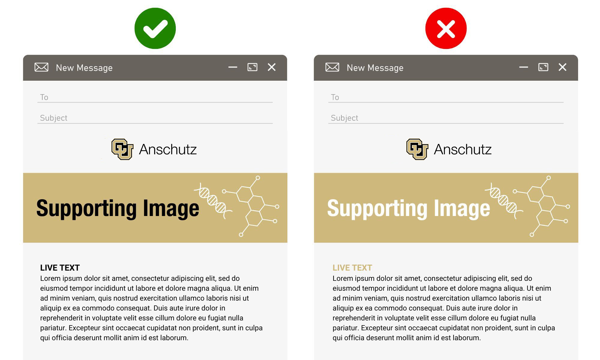
Refer to the CU Anschutz Brand Standards for accessible color combinations.
Another essential element of color accessibility is avoiding the use of color alone to convey meaning.
Communicating information only through color is inaccessible because not everyone perceives color in the same way. People with color blindness, low vision, or environmental limitations like glare may miss important information. Additionally, assistive technologies like screen readers do not interpret visual color cues, making color‑dependent information completely unavailable to many users.
To ensure accessibility, color should be used as a supplement, not the only method of communication. Important information, like instructions, errors, or status indicators, must also be conveyed through text, symbols, patterns, or programmatic cues so everyone can understand the content regardless of how they perceive or interact with it.
Consider which of the two images below would be accessible to someone who is red-green colorblind.
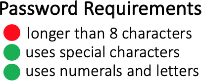
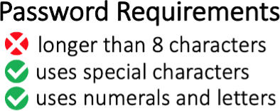
Without the additional icons (the X and checkmarks), the first image is inaccessible to someone who can’t distinguish between red and green because it only uses color to convey which password requirements have been met. The visual icons would also need alt text to describe each icon, such as “passed” for the green icon and “failed” for the red icon.